Atkinson Hyperlegible Font is aiming at greater legibility and readability for low vision readers. Goal achieved.

Don't miss Oliver's review1 of Atkinson Hyperlegible and his hints for pairing2 with other fonts. There is also an article3 by Susanna Zaraysky on the Material Design Blog. The font is available on Google Fonts4.
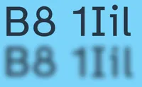
Atkinson Hyperlegible Font is named after Braille Institute founder, J. Robert Atkinson. What makes it different from traditional typography design is that it focuses on letterform distinction to increase character recognition, ultimately improving readability. We are making it free for anyone to use!
Atkinson Hyperlegible, Oliver Schöndorfer ↩︎
Free Font Pairs for Atkinson Hyperlegible, Oliver Schöndorfer ↩︎
From Rebranding to Readability with Atkinson Hyperlegible, Susanna Zaraysky, Material Design Blog, September 2022 ↩︎
Atkinson Hyperlegible, Google Fonts ↩︎