eleventy-embed-tweet
Kyle Mitofsky wrote the eleventy-embed-tweet plugin to fetch tweets during build time, optionally cache the tweets on the file system, and render them by accessing the static resources that came out of the build. I learned two things while integrating the plugin into my 11ty-powered blog.
Wrap the tweet URL in <p> tags when using it within a Markdown element
Tweets can be embedded in your Markdown by simply writing the URL to the tweet in a single line, like
https://twitter.com/jensimmons/status/1561060139523874820When quoting a tweet within a Markdown footnote (or any Markdown element), you have to wrap the URL into a paragraph, otherwise Kyle´s plugin will not recognize the URL as something to fetch data from Twitter for, e.g.:
[^jensimmons]:
<p>https://twitter.com/jensimmons/status/1561060139523874820</p>
That makes a lot of sense because it allows to have the tweet URL within a fenced code block to show code and not fetch tweet data. To be honest, Kyle has the wrapping into <p> elements in his documentation but somehow I didn´t realize it and only found out by looking into Kyle´s plugin code:
async function autoEmbedTweets(content, outputPath, options) {
  // https://regexr.com/5c39d
  let findTweets = /<p>(<a href=")?(https:\/\/twitter.com\/[^/]+\/status\/([0-9]+))(">\2<\/a>)?<\/p>/g
  return await asyncReplace(content, findTweets, async(match, p1, p2, p3) => {
      return await getTweet(p3, options)
  })
}
With CSS it´s a breeze to adjust the tweet style
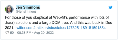
Of course, that´s not new. Since the days of the CSS Zen Garden we are aware of how powerful CSS is. But still. Below you can see what the default styling of a fetched tweet is and how I want to adjust the styling:


Kyle´s plugin comes with a default tweet style which can be deactivated in the plugin options with the useInlineStyles: false setting.
eleventyConfig.addPlugin(embedTweets, {
      cacheDirectory: '_tweets', /* Cache tweets in the _tweets folder */
      useInlineStyles: false, /*use your own CSS styles*/
      autoEmbed: true /*allow to embed a tweet by writing the URL within a single line in your Markdown */
  });
Then I´m using CSS to adjust the styling of the tweet to my blog layout. There is nothing fancy, except I´m using display:flex here and there, and change the order of display by leveraging the order property. The default value for the order property is 0. Keep in mind, the change of order is only visual, the HTML remains untouched and assistive technology like screen readers will follow the order of the HTML. Below you see the order of the HTML and the order of display.
.tweet-card
    .tweet-header
        .tweet-profile
        .tweet-author
            .tweet-author-name
            .tweet-author-handle
        .tweet-bird
            .tweet-bird-icon
    .tweet-body
    .tweet-images
    .tweet-footer
        .tweet-like
            .tweet-like-icon.tweet-icon
            .tweet-like-count
        .tweet-date
.tweet-card
    .tweet-body
    .tweet-images
    .tweet-header //changed order
        .tweet-bird //changed order
            .tweet-bird-icon
        .tweet-profile  //hide
        .tweet-author
            .tweet-author-name
            .tweet-author-handle
    .tweet-footer
        .tweet-like //hide
            .tweet-like-icon.tweet-icon
            .tweet-like-count
        .tweet-date
The change in order of display, as well as the hiding of content, is achieved through the below CSS. There is also some other styling in effect, like removing text-decoration properties or using italic and normal font-styles, but you cannot see everything that´s happening from the the below CSS because some styles are inherited from my blog´s CSS and those are not shown below.
.tweet-card {
    display: flex;
    flex-direction: column;
}

.tweet-header {
    order: 1;
    display: flex;
}

.tweet-profile {
    display: none;
    order: 2;
}

.tweet-author {
    font-style: normal;
    order: 1;
}

.tweet-author-name {
    font-weight: var(--font-weight-bold);
    text-decoration: none;
}

.tweet-author-handle {
    font-size: smaller;
    text-decoration: none;
}

.tweet-bird {
    order: 0;
}

.tweet-bird-icon {
    background-image: url(/img/twitter.svg);
    width: 1em;
    height: calc(1em * var(--lh-default));
    background-size: contain;
    background-repeat: no-repeat;
    background-position: center left;
    margin-right: var(--space-d1);
}

.tweet-body {
    order: 0;
}

.tweet-footer {
    order: 2;
    font-style: normal;
    font-size: smaller;
    text-decoration: none;
}

.tweet-like {
    display: none;
}

.tweet-date {
    text-decoration: none;
}
You could say, that´s what CSS is for, and you are right. But when I look at what can be achieved with a few lines of CSS I´m satisfied because of the possibilities.