Horizontal positioning
I often use what I call a split, with which I mean aligning a flexible number of items horizontally in a single row, each item maintaining an equal width without overflowing the container that holds the items.
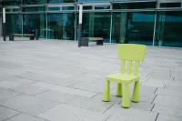
A split with images looks like:
Start with the most basic HTML:
<figure class="split">
<img src="/img/code/DSCF1384.webp">
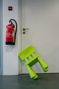
<img src="/img/code/DSCF1390.webp">
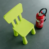
<img src="/img/code/DSCF1402.webp">
</figure>and apply the horizontal positioning by assigning the following CSS styling via the split class:
.split {
  display: grid; /* use grid layout */
  grid-auto-columns: minmax(0, 1fr); /* use a variable amount of columns and make each column the same size */
  grid-auto-flow: column; /* add new columns as necessary */
  gap: 3rem; /* have a gap between each column */
}
.split img {
  object-fit: scale-down; /* if images are too wide, they have to be scaled down to fit into the row */
}
.split > * {
  margin: 0; /* what is placed inside a column should not have a margin */
}
Probably you would not just show the images within the figure tag, but also have a figcaption for each image, like below:
In that case your CSS does not change and your html will be expanded like follows:
<figure class="split">
  <figure>
    <img src="/img/code/DSCF1384.webp">
	  <figcaption>
			Adventures of a small chair, part I.
	  </figcaption>
  </figure>
  <figure>
    <img src="/img/code/DSCF1390.webp">
	  <figcaption>
			Adventures of a small chair, part II.
	  </figcaption>
  </figure>
  <figure>
    <img src="/img/code/DSCF1402.webp">
	  <figcaption>
			Adventures of a small chair, part III.
	  </figcaption>
  </figure>
</figure>
Vertical positioning
You can push the content of each split column to the bottom, like:
For the bottom-push appearance you will again use the same HTML and assign the CSS classes split end . Like so:
<figure class="split end">
  <figure>
    <img src="/img/code/DSCF1384.webp">
	  <figcaption>
			Adventures of a small chair, part I.
	  </figcaption>
  </figure>
  <figure>
    <img src="/img/code/DSCF1390.webp">
	  <figcaption>
			Adventures of a small chair, part II.
	  </figcaption>
  </figure>
  <figure>
    <img src="/img/code/DSCF1402.webp">
	  <figcaption>
			Adventures of a small chair, part III.
	  </figcaption>
  </figure>
</figure>
The end class will introduce a flexbox layout for each column inside of the split grid:
.split.end > * {
  display: flex; /* display each direct child of the split container with flexbox layout */
  flex-direction: column; /* the main-axis of the flexbox will   go top to bottom */
  justify-content: end; /* the items on the main-axis will be pushed to the bottom */
}
Vertically centering each column can be achieved with:
.split.center > * {
  display: flex;
  flex-direction: column;
  justify-content: center; /* center the items on the main-axis */
}
Explicitly aligning to the top (which is default) will require:
.split.start > * {
  display: flex;
  flex-direction: column;
  justify-content: start; /* push items on the main-axis to the top */
}
Reverting order
When pushing figure tags with figcaption to the bottom, the vertical alignment of the images inside the figure can differ because the captions might have different heights. There are two options to avoid that: 1) adjust your HTML to have the figcaption above the image, 2) revert the order of display using CSS. I use the second option, which looks like:
It can be achieved by assigning the CSS classes split end reverse:
<figure class="split end reverse">
  <figure>
    <img src="/img/code/DSCF1384.webp">
	  <figcaption>
			Adventures of a small chair, part I.
	  </figcaption>
  </figure>
  <figure>
    <img src="/img/code/DSCF1390.webp">
	  <figcaption>
			Adventures of a small chair, part II.
	  </figcaption>
  </figure>
  <figure>
    <img src="/img/code/DSCF1402.webp">
	  <figcaption>
			Adventures of a small chair, part III.
	  </figcaption>
  </figure>
</figure>
The reverse class is defined as:
.split.end.reverse > * {
  display: flex; /* display each direct child of the split container with flexbox layout */
  flex-direction: column-reverse; /* the main-axis of the flexbox will go bottom to top */
  justify-content: start; /* the items on the main-axis will be pushed to the bottom, because the flex direction is reversed, whe have to justify the content to the start to get it pushed to the bottom */
}
The complete CSS
Here is the complete CSS in one go:
.split {
  display: grid; /* use grid layout */
  grid-auto-columns: minmax(0, 1fr); /* use a variable amount of columns and make each column the same size */
  grid-auto-flow: column; /* add new columns as necessary */
  gap: 3rem; /* have a gap between each column */
}
.split img {
  object-fit: scale-down; /* if images are too wide, they have to be scaled down to fit into the row */
}
.split > * {
  margin: 0; /* what is placed inside a column should not have a margin */
}
.split.start > * {
  display: flex;
  flex-direction: column;
  justify-content: start; /* push items on the main-axis to the top */
}
.split.center > * {
  display: flex;
  flex-direction: column;
  justify-content: center; /* center the items on the main-axis */
}
.split.end > * {
  display: flex; /* display each direct child of the split container with flexbox layout */
  flex-direction: column; /* the main-axis of the flexbox will   go top to bottom */
  justify-content: end; /* the items on the main-axis will be pushed to the bottom */
}
.split.end.reverse > * {
  display: flex; /* display each direct child of the split container with flexbox layout */
  flex-direction: column-reverse; /* the main-axis of the flexbox will go bottom to top */
  justify-content: start; /* the items on the main-axis will be pushed to the bottom, because the flex direction is reversed, whe have justify the content to the start */
}
Tailwind CSS
Less code is required to achieve the same with Tailwind CSS:
/* Tailwind CSS */
.split {
  @apply grid auto-cols-fr grid-flow-col gap-12;
}
.split img {
  @apply object-scale-down;
}
.split > * {
  @apply m-0;
}
.split.start > * {
  @apply flex flex-col justify-start;
}
.split.center > * {
  @apply flex flex-col justify-center;
}
.split.end > * {
  @apply flex flex-col justify-end;
}
.split.end.reverse > * {
  @apply flex flex-col-reverse justify-start;
}