Checkboxes and radio buttons convey a clear state in a simple way: A check means "on", a missing check means "off".
A toggle, in contrast, needs additional explanation for the "on" and "off" state, whether it's through color-coding (green for "on", red or grey for "off"), or through text. A toggle is not natively supported by web browsers1, which means developers need to build them, which makes the use of toggles inconsistent across the web. Red and green colors will be a problem for red/green disabled people (8% of males and 0.5% of females are affected, according to About Colour Blindness). It is also not clear to me, if, as a convention, a toggle thumb at the right means "on" and at the left means "off".
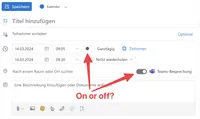
See the example below, which is a screenshot from the web-version of Microsoft Outlook. You cannot tell easily which of the two toggles is on or off.

Toggles fail to convey their current status without making users think! They also have very poor accessibility for users with disabilities. They are used inconsistently across the web, and they don’t have native HTML support. Use checkboxes or radio groups instead.
Joel Holmberg has good arguments for his position and I agree. If you want to know better, read his excellent article Toggles suck!.2 Further reading: Toggle Switch Guidelines, by Alita Joyce on nngroup.com, and Safari Gets a Toggle Switch Input, by Dave Rupert on frontendmasters.com.
The only web browser supporting toggles natively at the time of writing is Safari. Please refer to Safari has a native toggle control. ↩︎
Along the way you will learn that placeholder text inside form fields is to be avoided because users sometimes assume the field is populated with content and will not require any more work. The same is true for labels that are positioned inside of fields and move away once the users puts the focus inside of the field (like with Material UI components) ↩︎