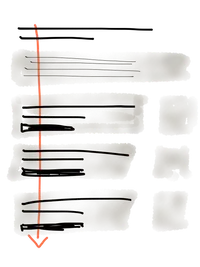
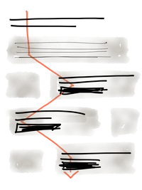
Anchoring the most important information to the Y-axis will support better communication, says Christopher Butler in his essay Using the Y-Axis to Maintain Focus and Attention. It allows a viewer to accelerate their scan without losing accuracy or restarting their visual orientation process. I find Christopher's two examples compelling in that regard.

